
Reporting
Ask your questions on your data using DIY dashboards.
Staple Analytics is a self-serve reporting workspace built into the product. Build the charts and dashboards you actually need, drill from any number down to the rows behind it, and have the report land in your inbox on a schedule you set. No ticket, no release, no waiting.
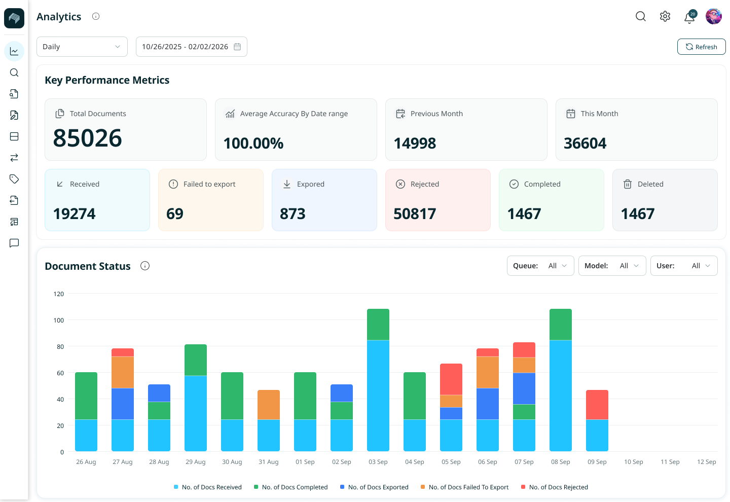
The data exists.
Getting a report out of it still needs engineering.
Most processing tools give you fixed charts and stop there.
When a team needs a different view, a new breakdown, a different date range, a report for a specific stakeholder, someone raises a ticket and waits.
The people closest to the data can't answer their own questions, and the numbers stay locked behind whoever can build the chart.
How Staple Reporting Works
Self-Serve Dashboards
Build, organize, and share dashboards without waiting for engineering support.
Create, favorite, rename, duplicate, or delete dashboards whenever you need. Build charts by choosing the fields yourself, reuse charts your colleagues have already created, or simply describe what you want in plain language. Share dashboards with specific people or your entire organization, and control whether they can view, edit, or own them.
The questions you have today get answered today, not in the next release. This gives every team faster access to insights and helps uncover patterns and changes that would otherwise be missed.

A Chart Builder Anyone Can Use
Create a chart by picking a dataset, shaping it with filters and groupings, choosing what to measure, and selecting how to show it, as a table, bar, line, pie, or single-value tile.
Drill into any value to see the detail beneath it, and change how a number is summed or averaged on the fly.

Let the Numbers Come to You
Schedule a dashboard to arrive by email daily, weekly, or monthly, so the people who need it stop logging in to look.
Set a goal line on a chart and get told the moment it is crossed, either above or below.Nobody has to remember to check.

One Dashboard, Correct for Every Viewer
Share a dashboard and you share its layout, not its data.
Each person sees only their own organisation and only the queues their account can access, so a shared view stays safe to share.
A Standard seat builds and shares. An Admin seat also sees every dashboard in the organisation.
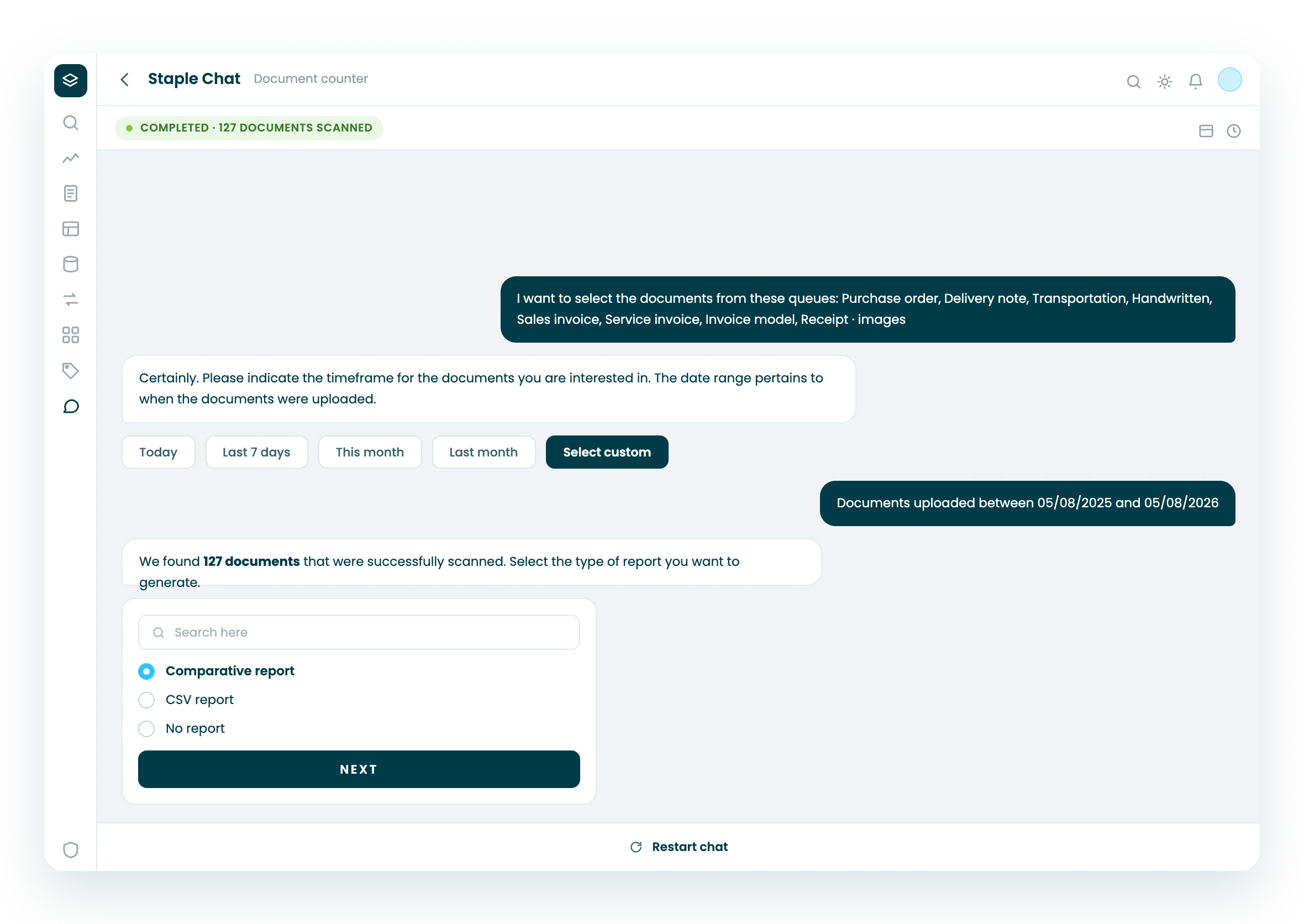
Search and Chat Across Your Documents
Reporting answers questions about your data in aggregate.
When you need the documents themselves, search filters by queue, document type, field, filename, status, handler, and date, and takes the same request in plain language.
Chat goes further: summarise a document, ask across several, or compare them, with inline citations back to the source.



See Staple reporting on your own data.
Book a 30-minute demo. We'll show you dashboards, exports, and scheduled reports running on real processed data.
FAQ
What is Staple Analytics?
Staple Analytics is a self-serve reporting workspace built into Staple. You query the data your documents generate, build your own charts and dashboards, drill from any number into the rows behind it, and schedule reports and alerts, without filing a request and waiting for a release.
How do I build a chart?
Three ways. Build a question yourself by picking the fields and setting what goes on each axis. Reuse a question someone already saved in a Collection. Or describe the chart you want in plain language and assign the result to a dashboard.
What is the difference between a subscription and an alert?
A subscription emails a whole dashboard on a schedule, daily, weekly, or monthly. An alert emails you when a single chart crosses a threshold you set, either rising above a goal or dropping below it. An alert needs a goal line configured in the chart settings first; a subscription needs nothing. There is no hourly option, because the data is not live.
Does everyone see the same numbers on a shared dashboard?
No, and that is deliberate. Sharing a dashboard shares its layout, not its data. Two rules decide what any viewer sees: your organisation only, so you never see another customer's data, and your queues only, so each person sees the queues their Staple account can access. A banner on every analytics page makes this explicit, so a difference between viewers is never mistaken for an error.
What can I export?
A whole dashboard exports as a PDF. An individual chart exports as CSV, XLSX, JSON, or PNG, so results open directly in the tools your finance and operations teams already use.